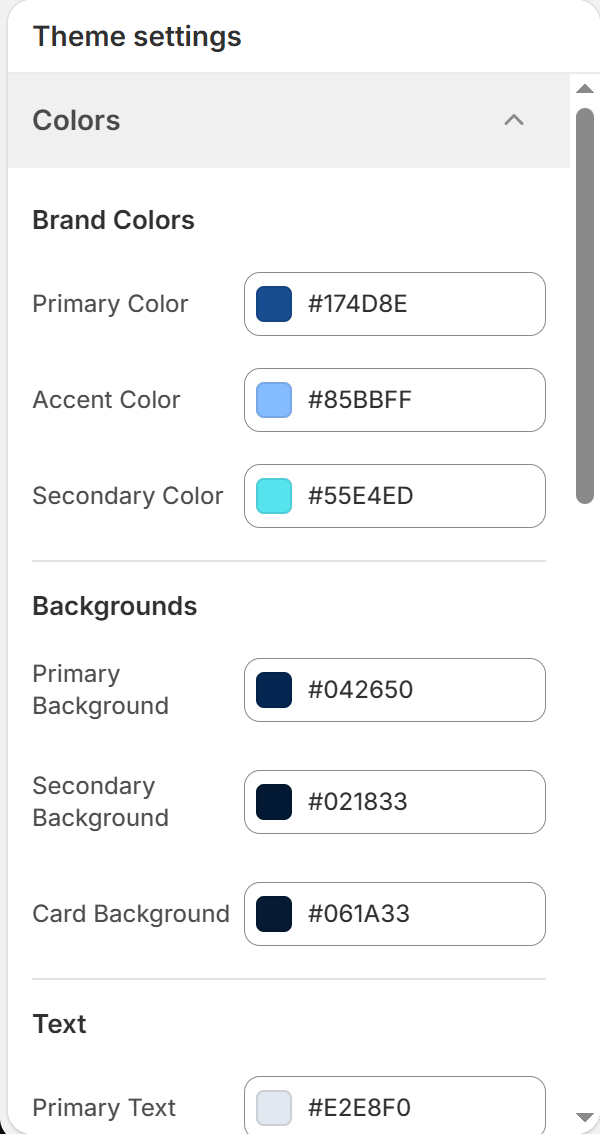
BoltTheme features a structured color system that coordinates branding values and accessibility styling across your entire storefront.
Configuring Your Colors
Access your colors panel via Theme Settings (Gear Icon) > Colors. You will find customizable options grouped into Brand, Background, Text, and Status variables.
1. Brand Colors
These values dictate the main brand identities of your store:
- Primary Color (Default:
#174d8e):
* The main structural color. Used for large checkout buttons, primary titles, focus buttons, and banner titles.
- Accent Color (Default:
#85bbff):
* A complementary bright color. Used to highlight active link hover states, rating stars, and callout margins.
- Secondary Color (Default:
#55e4ed):
* Used for auxiliary badges, stock warnings, and sale labels.
2. Background Layers
Background colors define the depth and card boundaries of your website sections:
- Primary Background (Default:
#042650):
* The default background fill behind your main homepage sections and product pages.
- Secondary Background (Default:
#021833):
* An alternative shade used to separate sections, color table headers, or fill the site footer area.
- Card Background (Default:
#061a33):
* The fill color for card boundaries, including product cards, search entries, and blog grids.
3. Text and Status Indicators
- Primary Text: Color for major headers and H1–H6 elements.
- Secondary Text: Color for general paragraph details and descriptive lines.
- Muted Text: Sub-labels, pricing compare-at numbers, and helper text.
- Border Color: Used for page dividing lines and table borders.
- Status Colors: Colors for system status alerts (Success, Warning, and Error).